Behind the pixels – Redesigning Tresorit’s desktop apps


During the past 4 years, we’ve redesigned Tresorit and the way it works a couple of times. Besides these bigger efforts, we are continuously working on enhancing the user experience by polishing up our app’s interface. Designing applications is a never-ending job, similar to painting the Golden Gate bridge: some parts are shiny and new, but there are some rusty bits here and there that need more work.
Non-stop development means frequent redesign
There are various reasons behind the decision of changing the design of an app. First, as we develop our product and it gets better and smarter, new features are added and need to be accommodated within the app. We aim to create timeless and flexible designs, but sometimes the addition of features requires a larger change to the existing interface. On the other hand, the environments of our applications are constantly evolving. Operating systems are frequently updated, bringing new design opportunities and requirements.
Moving from Tresorit 2.0 to 3.0
When designing Tresorit’s UI, our UX team keeps these three basic principles in mind at all times.
- Native first: more features, less eye-candy
Native design means that the app follows the design language of the platform. For example, search bars are designed differently in Mac, Windows and Linux. By designing a UI that is close to the platform, we want to help people to find their way intuitively in the application. When designing Tresorit 3.0, we had two goals. First, have a unified Tresorit design across all desktop and mobile platforms, from Mac to Windows and from iOS to Android. And second, create a native feel to the applications by using the platforms’ design language and best practices even better. Creating apps with these two goals in mind all the time is a tricky job.
- Evolution, not revolution
Another essential principle is that we want to make the transition from one version to the other as smooth as possible. We’d like our users to be able to easily update and get used to the new apps as quickly as possible without feeling they have to relearn to use a new service.
- Secure AND easy-to-use
We fundamentally believe that end-to-end encryption should be easy-to-use and built-in within the application, invisible to the users but ensuring their protection at all times. Being user-friendly in itself is a security feature, as it helps our users enjoy the best protection for their files and data without any additional efforts on their side. One good example is the way how sharing works in Tresorit now. A long time ago, however, sharing was based on the crypto handshake method, which meant that both parties had to be online in order to share files or folders with each other. It was secure but we weren’t happy with the complicated usability. We put a lot of effort into developing a new solution that works automatically in the background.
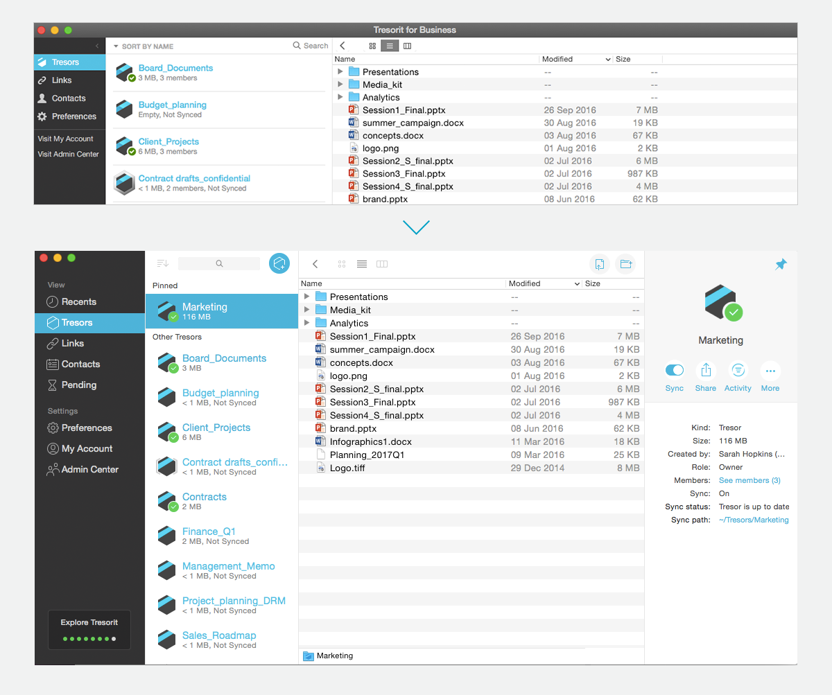
Hello, Tresorit 3.0!
With these principles in mind, we started designing Tresorit 3.0 one and a half years ago. Using the input from testers, translators and the whole Tresorit team, our UX designers and developers have been working hard to create a user interface that reflects the evolution of operating systems on all desktop platforms. Now, we are extremely happy to present you the new UI both on Mac and Windows. This is what we wanted to improve with 3.0:
- Look and work as a native app
Working with multiple files, managing teamwork and cooperating with partners can be demanding. Therefore, we want to create a file sync & sharing tool that enables smooth collaboration by fitting smoothly in the daily workflow of our users.
- Refresh the design
Although we kept the core design of the previous version, we refreshed the visual elements and updated typography, colors, icons, and the navigation.
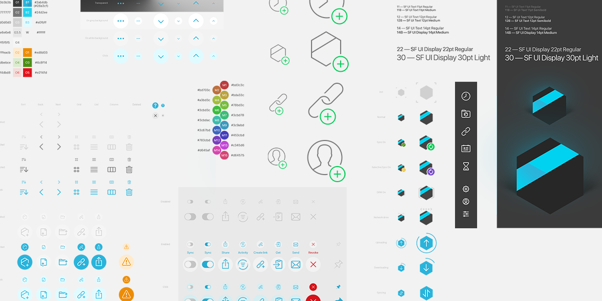
We do love icons
- Emphasize core features
We wanted to highlight Tresorit’s key features, such as Share, Link, Activity or Versions. They are the most important functions for our users, so they need to be easy to find.
- Create better architecture
By adding new features and functionalities to the application, we have to find the best place for them to help our users quickly find the new features.
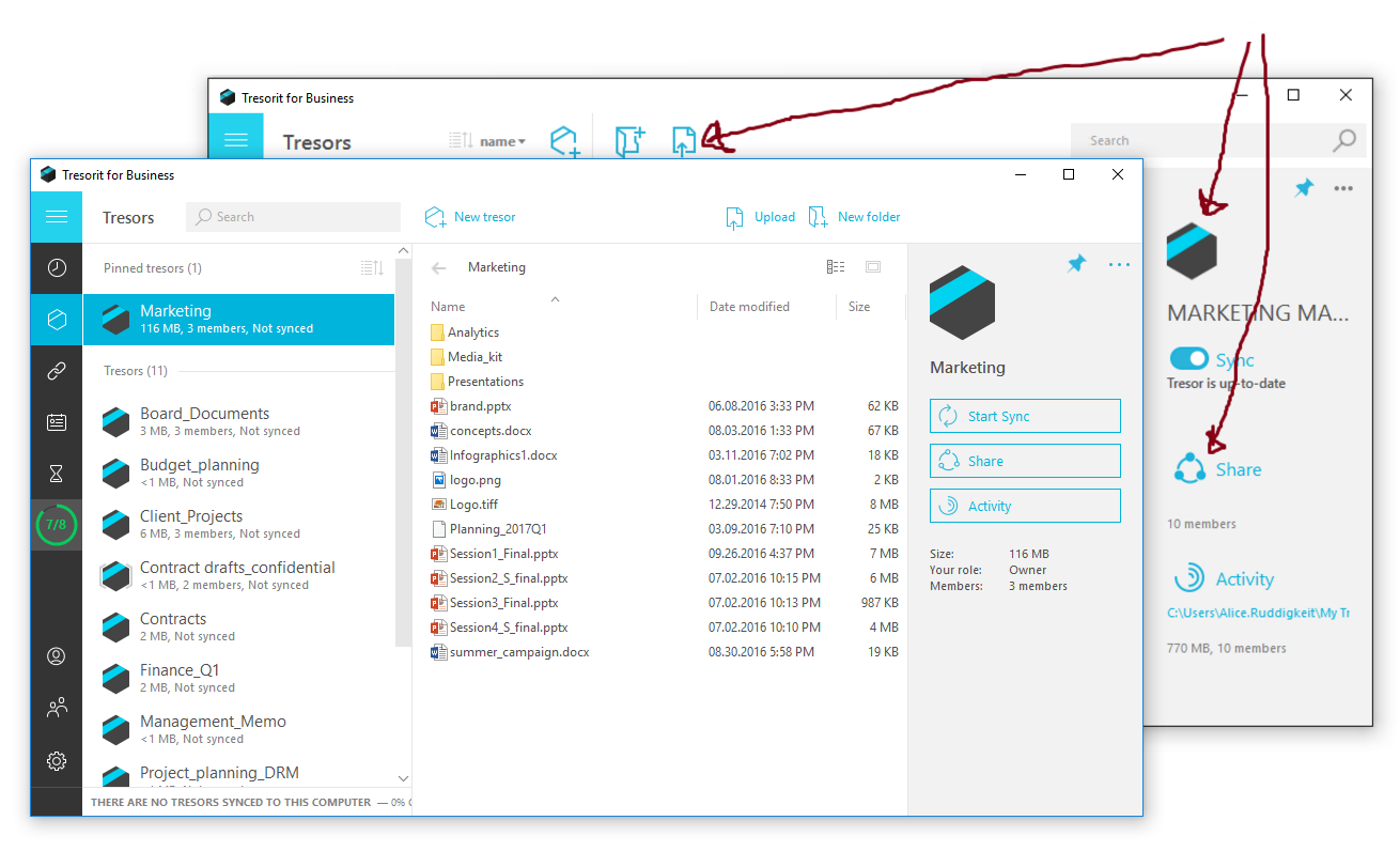 Work in progress – The evolution of the Tresorit 3.0 design for Windows
- Optimize for daily use
Optimized for what we have been learning about our users and their needs from user tests, interviews and all the great feedback we receive via sales, support and social media, we wanted to create an interface that is simple and easy to use.
- Get rid of “hover effects”
Hover effects were probably the most problematic issue in the previous version. They were functioning well until Tresorit’s main functionality was managing files, but over time, we have added multiple new things, and now there is much more you can do with Tresorit.
We hope you like the new design and will enjoy using Tresorit 3.0. If you have any questions or feedback about the new look, please contact us!
Get Tresorit 3.0


